
Bitcoin: the Histogram contra the Hysteria
Dear Readers,

Ok, so ‘hysteria’ might be a bit of an exaggeration to describe the prevailing anxiety about current Bitcoin price developments, but it makes for a good title^^. Of course, such anxiety in the marketplace is perfectly natural - we’ve weathered an extended period of declining prices, where sentiment had turned overwhelmingly bearish. Of course this sentiment is something to be critical of when standing back to look at the long-term chart from a more rational and critical perspective - just as it took many a month for the market to finally turn bearish, once price was well into its decline from the top; so too it will no doubt in turn take months for the market to turn bullish, once price is well into its incline from the bottom. Beyond this purely contrarian reading of sentiment, this article will simply focus on the technicals, and in particular on the MACD as it relates to the the monthly/ longest time-frame, an indicator that has served only too well in the past.
On Using Technical Indicators
The reason we use technical indicators is to smooth out the daily volatility that can all too easily whip our sentiment one way then the other. Yesterday, the price was down and we feel bearish; today the price is up and we feel bullish. With the use of the longer-term indicators, we can smooth out even more of that volatility. This enables a more stable and rational approach to our trades and investments:
But the reader may be left wondering how drawing a few lines on a chart could equate to an empirical science. To which I’d reply that the crucial factor here is time. If time were to be placed on a spectrum, with the shortest of periods at one end and the longest of periods at the other, randomness and possibility would belong to the shortest periods, while pattern and probability would belong to the longest periods. There would be varying degrees of probability/ randomness depending on what point of the spectrum you were dealing with - at the one end, minutes would be near completely random, at the other end, years would have a much higher degree of probability. Just as with any science, where momentary observations only start to make sense when accumulated into a mass over a longer period of time, so too with TA. It applies most effectively [with a higher probability] to longer time-frames, where lines might be drawn and trends discerned.
Of course, emotion will still be involved [we are all too human, not purely calculating machines], but, ideally, it will be minimized. Nor will the technicals be allowed a complete supremacy, where they are elevated enthusiastically into certainties and dogma [that human nature again]. Just as sobriety is maintained on the one hand against sentiment, so too it’s maintained against the technicals, with its desire for statistical or mathematical certainty. From the same article as quoted above:
People tend to ask of TA too much on the one hand, or too little of it on the other. They may imagine that the chartist has a crystal ball to call price correctly, or failing that, must be irremediably a slave to his bias and prejudice. The truth of the matter is however that these two views are the two opposite ends of a spectrum, and all chartists could be arranged along the length of this spectrum at some point or another. The rational practitioner of TA would be somewhere in the middle of this spectrum, neither providing a certainty, nor capitulating and pandering to what he and others want from the chart. For the chart, if anything, serves as a reality principle against which his wishful thinking is corrected. First and foremost, the rational chartist recognizes the uncertainty principle.
And so we could consider the longer-term technical indicators as serving a crucial function of correcting sentiment, on the one hand, while also restraining us from the complete flip to an equal and opposite sentiment on the other. Remember, the parlance of market-talk is ‘bull’ and ‘bear’, monikers of the ‘animal spirits’, of the emotions and passions that drive us first one way and then the other. Those looking to ‘beat the house’ do well to take a savvier view, a more rational/ technical view that does not get caught up in the dichotomies of those passions, a view instead that looks to make use of those passions in trading/ investing with the aim of profit-taking [those caught in the throes of the bull, will not sell; those caught in the throes of the bear, will not buy].
And so to the MACD on the monthly chart as an instrument of sorts to navigate the most turbulent and disorientating flight that is the volatile Bitcoin market.
The Monthly MACD
First of, this needs to be on the log scale as the MACD measures numbers [of moving averages] and these numbers have exponentially increased. By moving the scale from linear to log, the MACD is enabled to measure the ratios, or the comparative proportionate moves. The MACD is a momentum indicator - when above the zero-line, it’s officially bullish; when below the zero-line, officially bearish. For the trader/ investor, optimal entry [or exit] is found at the bottom [or top]. The histogram signals a shift in momentum - a contracting histogram below the zero-line being a good signal for the buyer. There is also the comparative previous episodes or cycles to factor in to the decision-making process.


What strikes the viewer on first sight is the contracting histogram [red to white] signaling a shift in momentum. Where previously bearish momentum was increasing in a series of expanding histograms, we now see this bearish momentum decreasing in a series of contracting histograms. In comparing this to previous cyclical movements, this suggests a macro turnaround. Where price may continue to be volatile [and when is it not?], the contracting histogram is signaling the turnaround in the greater trend. Of note also is the comparative depth of the histograms across the cycles - bearish momentum only gets extended so far before contracting… and, as in the first chart above, this correlates to price.
Second, the MACD line itself [blue line] clearly depicts a lessoning of macro volatility - the price momentum is reducing on the macro scale leading to increasing price discovery and eventual price stability [in relative terms to today’s radical volatility]. In coming further below the zero-line, than the previous cycles, the MACD suggests the increased maturation of price - BTC is developing towards a more mature asset class [or should I say currency]. Extrapolating the line connecting the peaks gives a convergence on the zero-line around 2040.
Zooming back in on Price as it Relates to the MACD
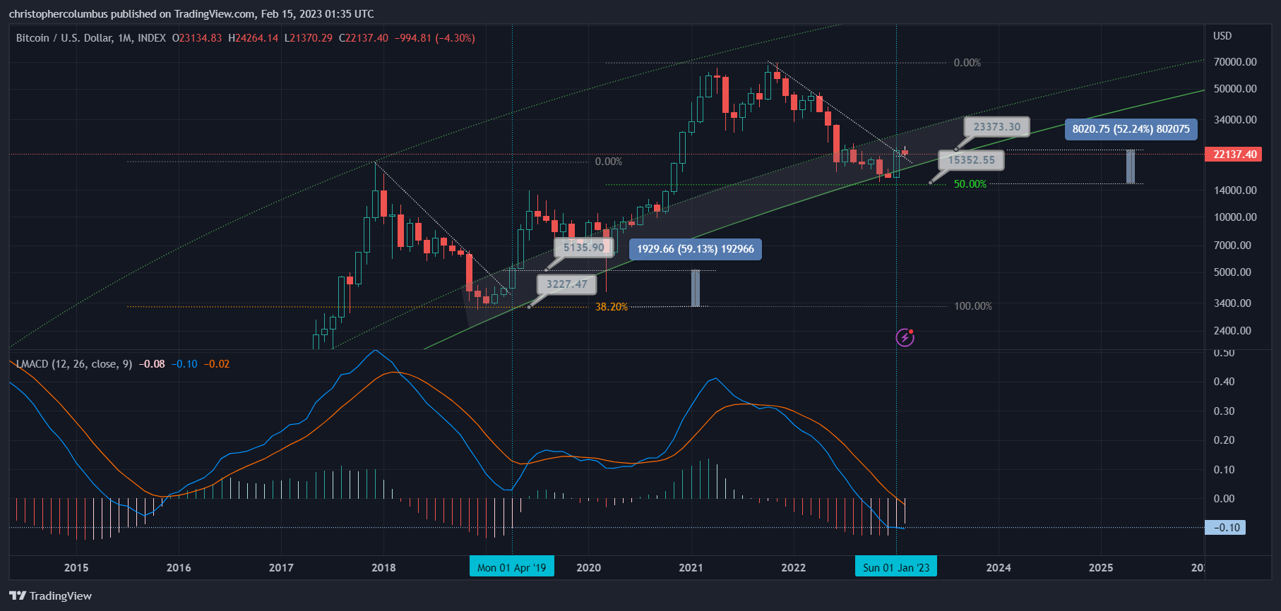
In regard to prospective buying, and the ever-present desire for cheaper prices, I think it’s interesting to compare the relative price levels between the present and past. In similar scenarios, you have similar set-ups. Where we today might not see such a huge difference between 3 and 5K, we do tend to see a huge difference between 15K and 23K… even though in real terms [percentages] they are near the same [at the time, buyers back then also perceived this huge difference].
This in turn makes us reluctant to buy, or average in, for the longer-term as we expect lower prices. And yes, we may see lower prices on volatility, but given the probability of the macro turnaround, there is now an equal risk that we won’t. Prospective buyers here, insofar as they bracket out the prevailing sentiment and focus on the technicals, are now faced with not only short-term risk of price movement to both sides, but also the probability of medium-term and longer-term risk of price movement to the upside. Accordingly, you’d have to think that the scales [of risk/ reward decision-making] are further weighted towards a buying strategy.
Conclusion
Just as longer-term indicators allow us to compare proportionately the more significant moves in the Bitcoin market, so too these indicators call for a proportionate response from ourselves. On the one hand, they should not be too pessimistically written off as gobbledygook by the cynic, nor should they be too optimistically latched onto by the enthusiast; rather, they should be viewed realistically and pragmatically by the trader/ investor who is looking to balance out both risk and reward in establishing a longer-term position. Arguably, at this juncture, it is perfectly reasonable for a pragmatic trader/ investor to buy a reasonable position in Bitcoin with the longer term trend in mind.
Until next time,
Stay [relatively] safe out there,
Dave the Wave.