
Breakout and Projection of Highs
Dear Readers,

As predicted, we have the breakout to new all-time highs in the price of Bitcoin. Given the past macro/ cyclical volatility of BTC price, naturally we want to start focusing on price projections - how high can it go? Of course, such a project is fraught with speculation… but that is what we do. But over and above the purely speculative aspect, there is also the ones of risk management and profit taking. While some no doubt are quite willing to sit in BTC long term and absorb the cyclical volatility, others will be looking to take some profit…. money being after all a means to an end.
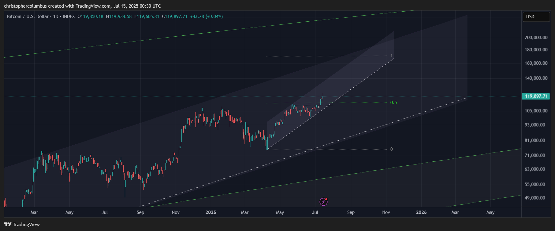
Macro Projection of Price
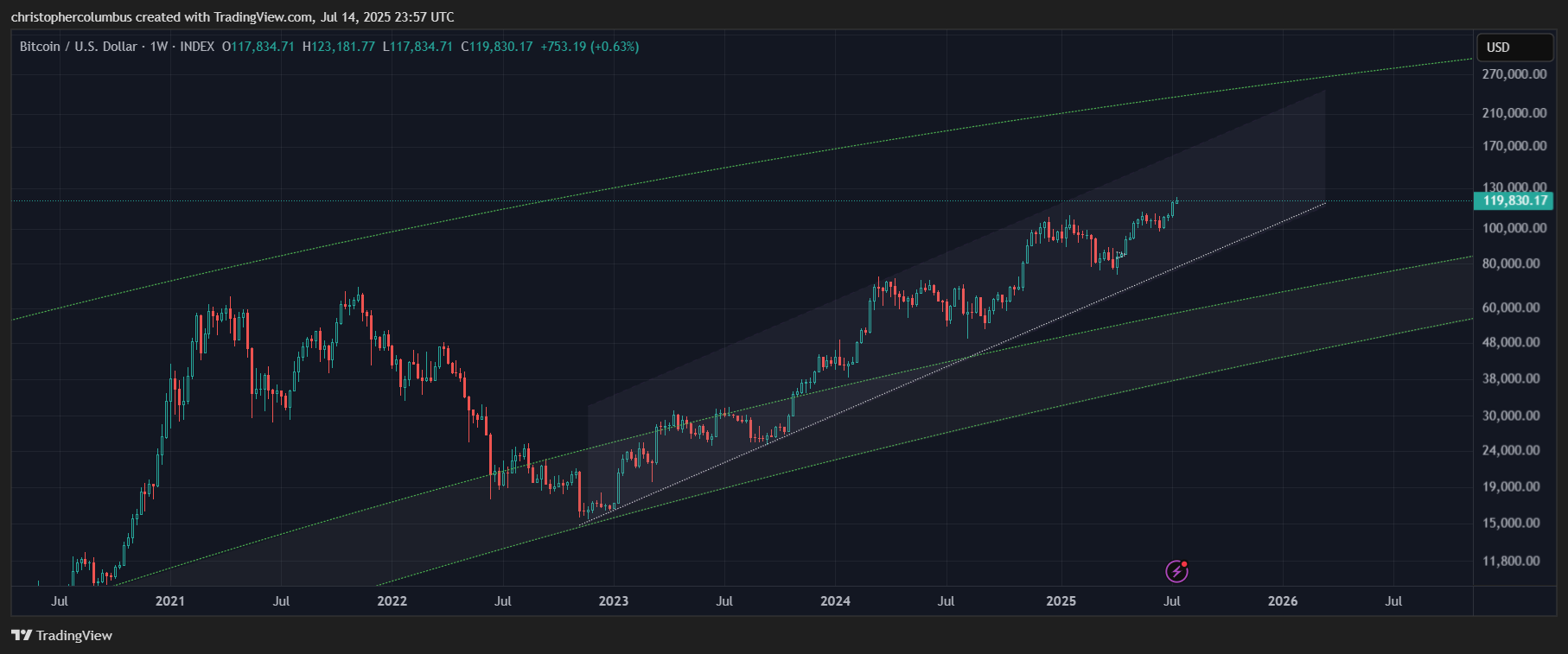
First of, the technical channel we’re all familiar with, itself within the greater channel of the LGC model. As previously noted, the price action is remarkably of a technical [as opposed to a parabolic] nature. Also of note is that price is of yet not too high in the LGC channel, i.e.; room to move.
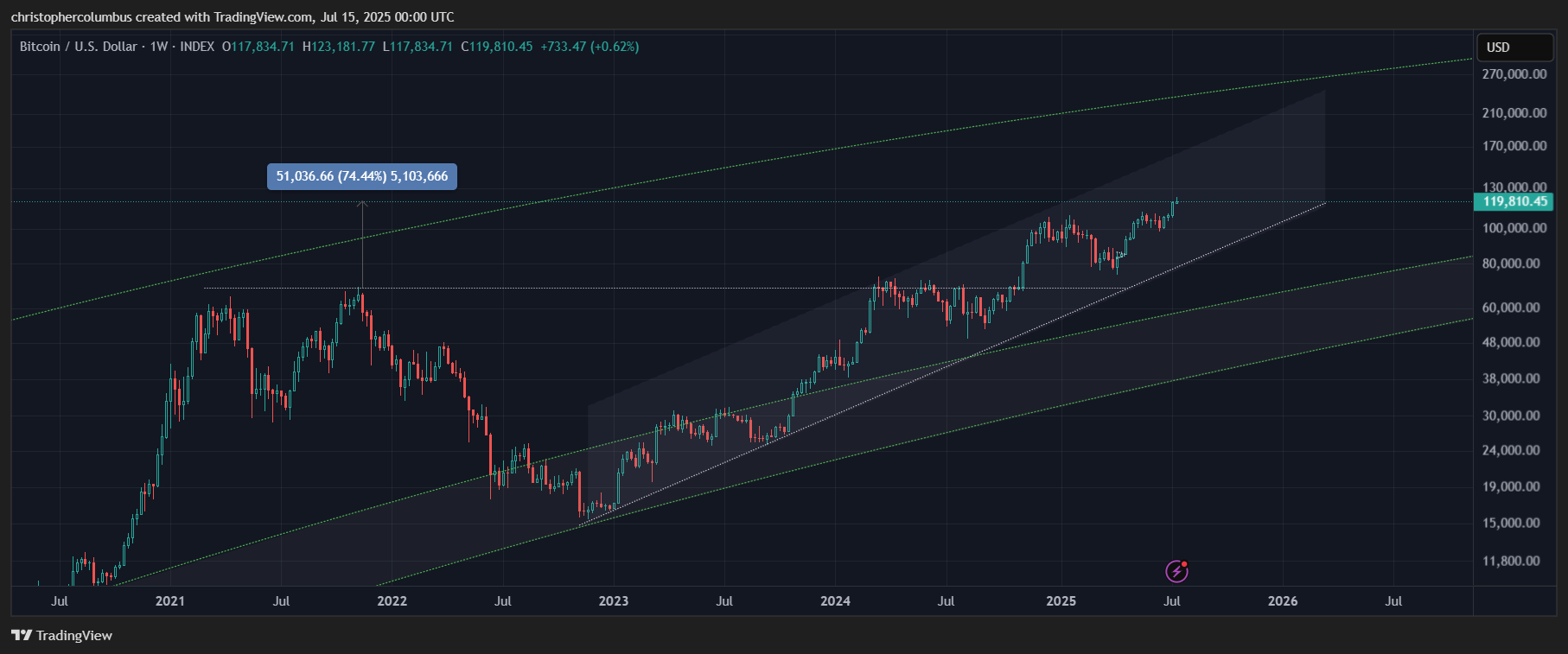
Current price is nearing 2x of the previous cyclical/ multi-year peak….
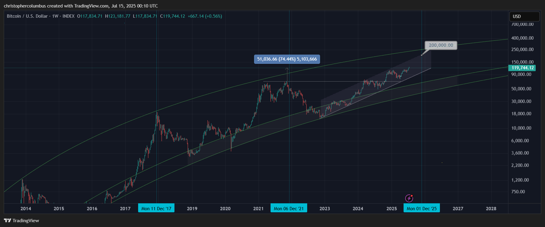
.. while if we’re to take a peak to peak multi-year cycle as a provisional benchmark, there is still half a year to run. In my opinion, it is more likely that the peak would front-run that time point as opposed to over-running it.
The ideal projected price here, where the top of the technical channel intersects with the time projection is 200k. It also sits just shy of the upper limit of the LGC channel to give it some further credibility. Could price go that high? Certainly possible. One way of cross checking this macro projection of price is against technical projections on a shorter-term time-frame involving a different methodology.
Technical Projections on the Shorter Time Frame
Having looked at the more macro projection of price - which I think provides for an upper limit/ cap to what price could do this cyclical time round - time to look at other technical projections on a shorter time-frame, now that we might well be at the business end of the cycle to see if there might be some correlation.
Zooming in on the daily chart, we’ve the chart that most are familiar with as posted often on X.
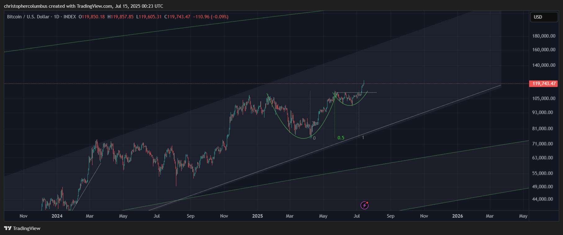
Time to get rid of the cup and handle, and the time fib, shorter-term technicals that have served their purposes, and to add future-orientated technicals that might be capable of projecting the highs.
Within the provisional time-frame assumed, we’ve the following factors that illustrate a 170k target achievable by the end of the year and not even requiring a parabolic move:
- a fib extension target measuring the local low to the breakout level
- a relatively steep rising upward channel that corroborates the target within the time-frame
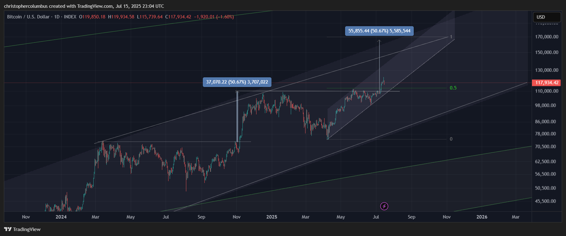
Other technical factors lining up to support this target are peak to peak extension within the time-frame hitting the range, and comparable percentage price rise to the previous move, to make this target perfectly feasible within the structure of the current market.
Summary
Though we can think of 170K or even 200k as huge numbers, technically they are not. The charts show that these numbers can be achieved in this market in an almost ‘business as usual’ manner. The numbers appear to be huge when we consider the element of money illusion in my opinion, and this is what the chart on the logarithmic scale can dispel.
The investor is not interested in some abstract price point, either peak or low, but rather on the potential return [or loss], the ROI [Return On Investment]. The investment is relative to the entry and the exit, and the return, in percentage terms, between these two points. The actual price of the instrument is irrelevant [buying into a high nominal price/ FOMO is a variant of money illusion]. What matters is the appreciation or the depreciation of the instrument that one is speculating in, and, as discussed in the previous article on money illusion, the reason why Crypto-currency moves exponentially is due to the available money/ capital on the sidelines looking to be ‘put to work’.
Given that the log scale tracks an instrument that moves exponentially on the y/ vertical axis, the technical tools to be used with this scale should themselves be in the log function. They will essentially measure the y axis spatially as this gives you the relative and proportional moves as relevant both to ROI and real values.
The chart shows what price is capable of [never a certainty] without going over the top with no technical guard rails. It essentially gives a middle position between those that over-awed by the number and between those where the number only ever goes up. The LGC model is in my opinion that set of guard rails, which is more interested in charting the market than marketing the chart.
The macro projection of price, the first part of this article, provides for an upper limit/ cap to what price could do this cyclical time round. In turn the technical projection of price gives a lower base. Combining the macro and technical projections in turn gives us a range within which it is speculated that peak price could attain; between 170 and 200k.
Until next time,
Stay [relatively] safe out there,
Dave the Wave.