BTC: Mapping Out the Correction
Dear Readers,
Time drags inexorably along, and here we are now already into the 2nd quarter of the year. Factoring in a year-long correction, given previous macro corrections, that would leave 2 more quarters for BTC to build its basing range.
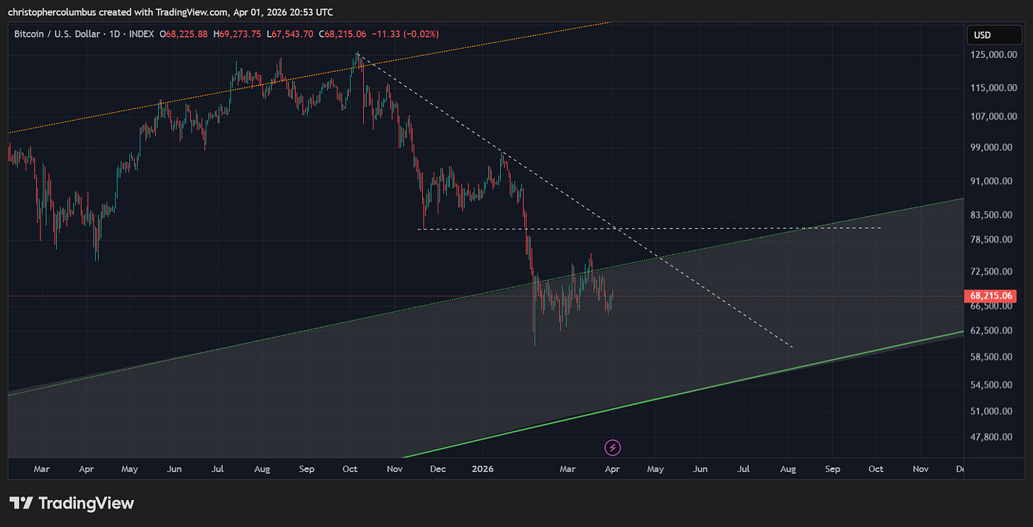
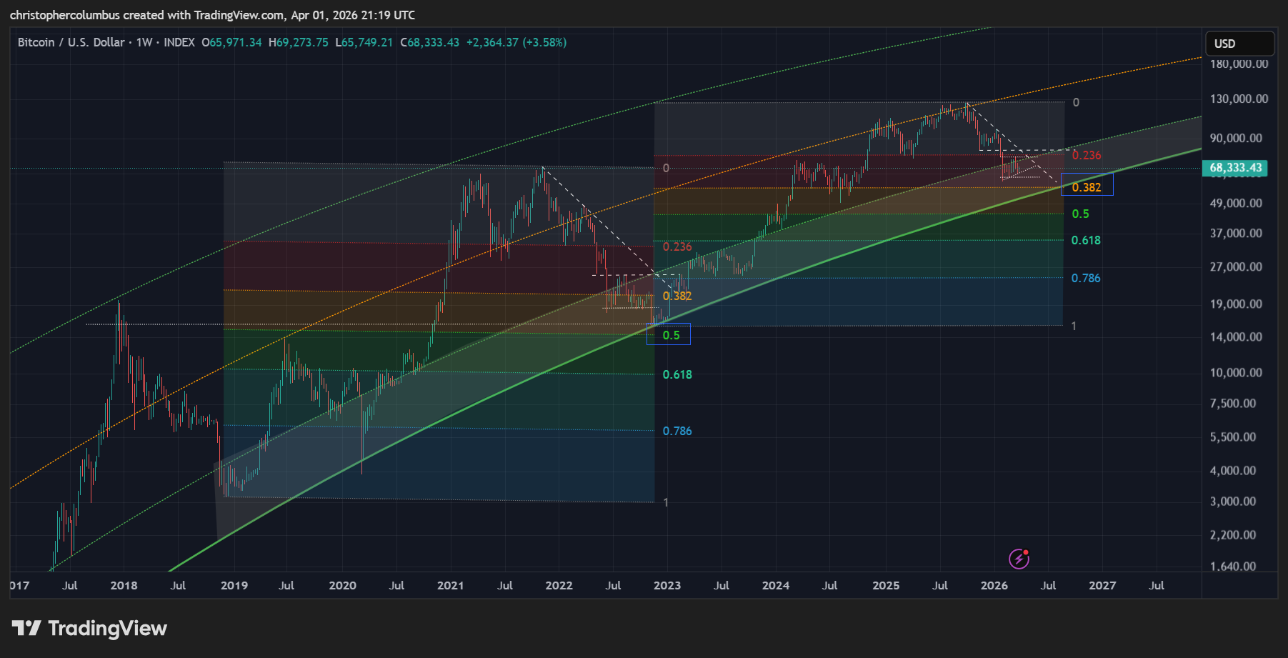
Daily Chart
The chart shows price still facing headwinds with it below major lines of resistance. That said it is also in the ‘buy zone’ of the LGC curve that has performed since 2018 [for three macro corrections now].
Though a solid range has formed, it should not surprise us if price faces some more serious resistance in a month or so’s time, where shorter-term strength would come into proximity with longer-term resistance. For the investor, another dip lower would be considered a buying opportunity on the basis of the LGC [Logarithmic Growth Curve model.
Weekly Chart
On the weekly chart, we see the comparison with the previous correction.
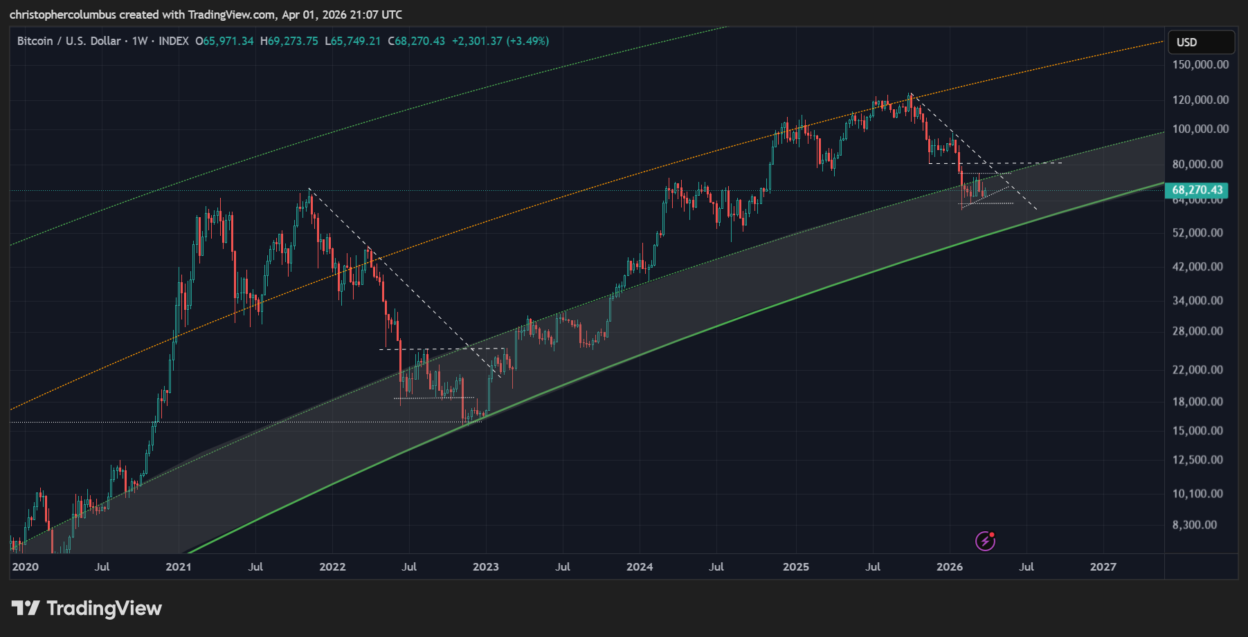
Though a pattern is discernable, it is of a lesser magnitude given the lack of a previous parabolic rise in the market. This time around, the price decline is more subdued just as the price rise of this cycle was [a more technical as opposed to a more parabolic market].
What stands out significantly in the comparison between cyclical corrections here is that the current phase of the correction matches up remarkably in the LGC ‘buy zone’ [the shaded area] as per previously. This also suggests that a final dip to the lower level of that band is on the cards. In expecting such a move, within a larger bullish context, we will not be overly alarmed when/ if it eventuates. As they say, the boy scout is always prepared.
What other corroborating technical factors can we find that might strengthen this outlook?
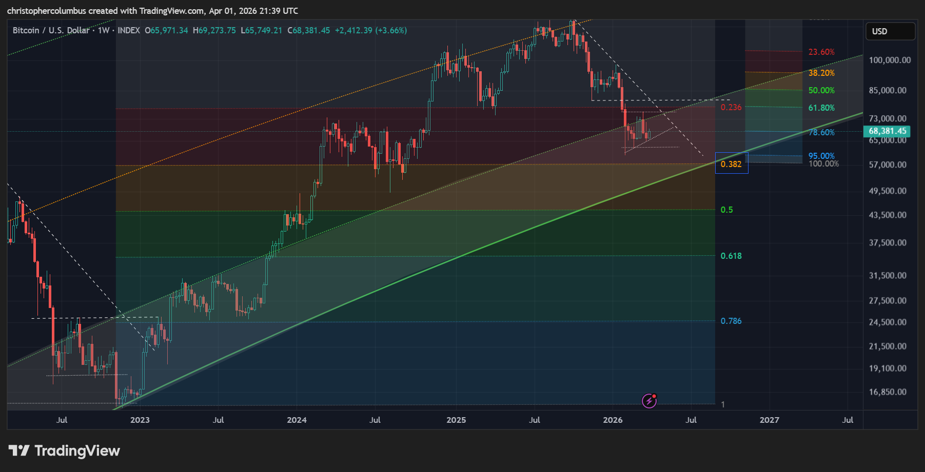
Though the previous cyclical correction was a full 50% [in real terms, of that move up], keep in mind this correction belonged to a more parabolic market.
If we are now in a more technical/ mature one, then a cyclical correction to a fib level higher than last time makes sense. Also making sense is current price correcting further down to that fib level of a real 38% correction.
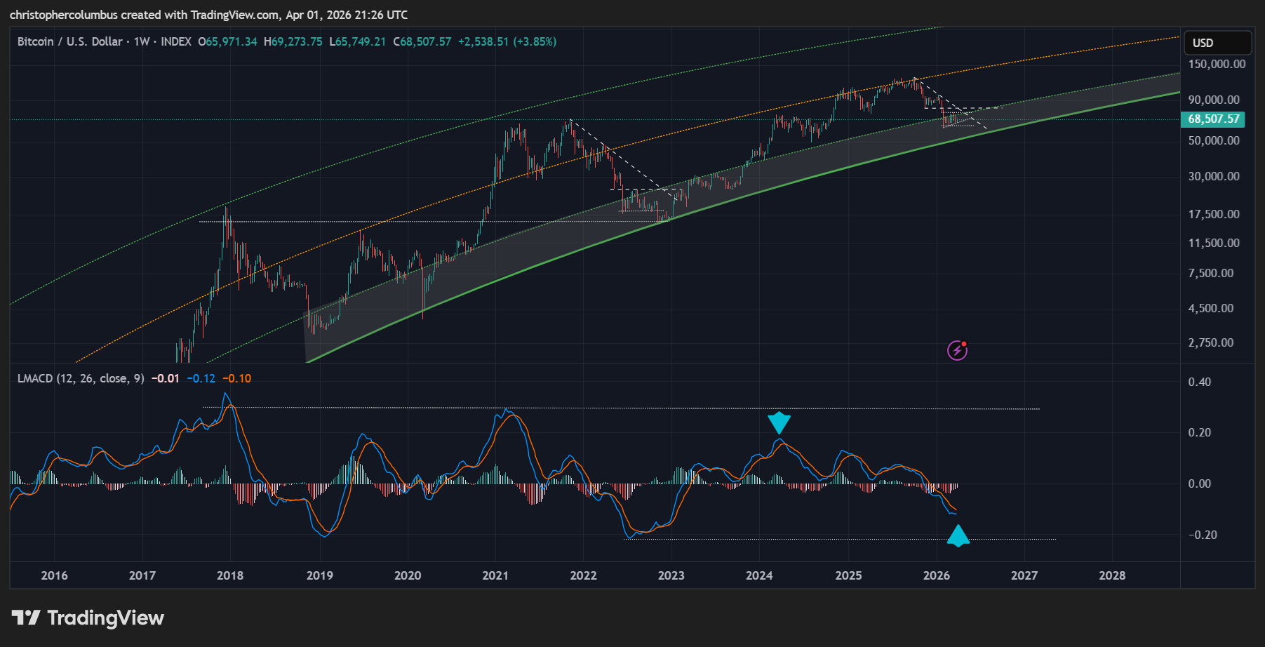
Also making sense is a weekly MACD not going as deep below the zero-line as previous, just as it did not go as high. This signals a maturing/ less volatile market in my opinion. Of course, that the MACD low is in does not necessarily signal the price low is in… but it does signal a macro turnaround in momentum - the building of that base for a move higher going forward.
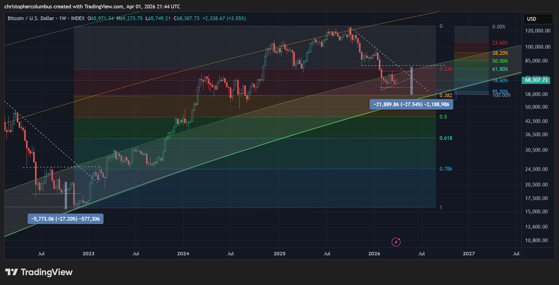
Finally, a chart to show how limited a further correction on the above lines as sketched would be. A final move of price down to the 38% fib level would only see price going a little lower than we saw previously in February. In real/ macro terms, 95% of the correction has already played out [as per the percentage measurement to the side], with only a further 5% to the 38% fib level.
Given shorter-term volatility however, with the possibility of price being higher in the short term, such a correction would be alarming for those unprepared for it. A further correction, in nominal/ percentage terms, from say 76K to 58K would be 24% and comparable to the final move down last time
Summary
While price is well positioned here, after an extended six month long correction, we can expect a further period of base building over the course of the next six months. This may well involve another dip to slightly lower prices than previous, which would set up well for the next cycle going forward.
Until next time,
Stay [relatively] safe out there,
Dave the Wave.