
BTC: Monthly MACD Finally Re-Crossing the Signal Line
Dear Readers,
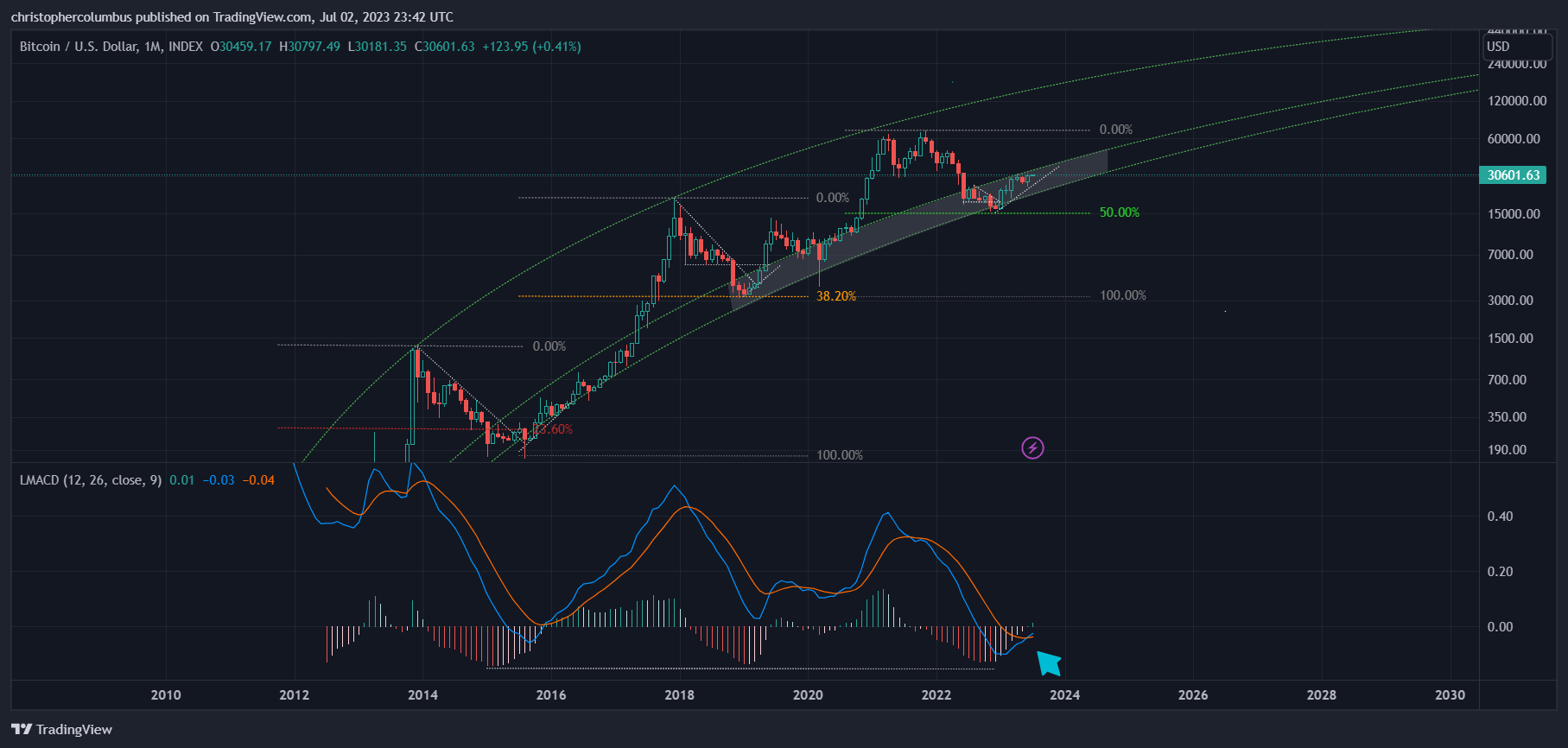

Yes, technically, the monthly MACD’s bullish re-crossing of its signal line is a big development. Besides the logarithmic growth curve [LGC] channel, this is the next most significant metric for the longer-term investor in my opinion, and one I’ve kept my eye on in both bull and bear markets. The MACD, here on the log scale, indicates momentum. With the longer time-frames given extra weight in my technical analysis, the monthly MACD is the one of most important, in contrast to the weekly and daily. Think of the monthly MACD with the momentum of an oil-tanker on the ocean, where it takes quite some time for it to change course.
Also of interest, as high-lighted in the second chart, is the equal time taken for the MACD to re-cross after first crossing - 22 months. The 2015 comparison is used here as the dynamic is more similar.
These are the charts, now for to a discussion on how reliable this indicator could be considered to be. Where some will say past performance is no guarantee of future results, this misses the point. It’s obvious that there are no guarantees of future results, for the future must always remain uncertain. It is not a question of certainty here, but one of confidence - can we, given the past performance of the monthly MACD, have some confidence in it continuing to perform [remember, risk can never be eliminated though it can be mitigated, and so the incentive to hedge investments]. In order to establish a continued confidence, it would help to turn to the past and look at some predictions that were then made on the basis of the MACD, and whether they played out.
Past Predictions
As tweets can no longer be embedded in Substack [as per this previous article], I’ll have to use screenshots, quotes and links instead. A click on the link will take you to the original tweet.
First, an earlier MACD chart from the end of 2021 at or near the top:
“A *perspective* if monthly momentum is to be compared on the chart. But as the peak [if it was the peak] was earlier, so too might be the bottom.”
https://twitter.com/davthewave/status/1462508193188237319?s=20

If the monthly MACD indicator suggested the top of the market at the end of 2021, which was then confirmed with subsequent price action, at a time when most were still in the throes of uber-bullishness, then doesn’t this then add extra weight or veracity to the metric now suggesting [if not confirming] a recovery in price on its path back toward higher prices?
In the chart above, we clearly see the MACD in a downward trend [bearish divergence] even as price was pushing new highs. The indicator suggested that momentum had topped out on the first peak as opposed to the second. Combined with the LGC, prices at that time looked frothy based on the technicals. Though the chart is long-term bullish on the macro, it did not see 50K + prices as a good time to buy. Rather, the chart saw the ‘buy zone’ as earlier, and yet to come again. And this at a time when many thought it was still a good time to buy… based on sentiment no doubt.
Next, to further strengthen the case of the monthly MACD [and its signal line that ‘smooths out’ the MACD], is an even earlier example chart from the beginning of 2019.
“Have to say I'm a bit surprised that more people are not looking at the growth curve to inform their TA. You'd think it would be the obvious go to metric. The monthly chart is looking good. MACD also looking good [extreme lagging indicator] where the histogram is rolling over.”
https://twitter.com/davthewave/status/1080407646425952256?s=20

Here we have the exact opposite situation to the one above, where the MACD, always a lagging indicator, suggested a buy when well into its downturn. The chart shows a commensurate level on the MACD indicator for an opportune time to buy as relating to the previous cycle. This technical indicator, combined with the model of the LGC channel enabled a risk-managed buy when the market sentiment was at its lows…. but then so too was price.
Those that followed the TA and bought, if they did not already have exposure, would now be sitting on a 9.4x return. Interestingly, and to add further weight to this indicator, an extrapolation and updating of that chart gave yet another opportune time to buy during the middle of 2022 last year. Those that were still unexposed to Bitcoin, who bought that level, would be sitting relatively comfortable now with anywhere between a 50 and 80% increase in price.

To finish with, the reader may look at the current price of Bitcoin at 31K, look back at its bottom at 16K, and wonder how a re-crossing of the MACD’s monthly signal line helps. As I mentioned earlier, the MACD, as conventionally used, is known as a lagging indicator, and this re-crossing serves as a reasonable or technical confirmation of what has already happened, i.e.; lower prices than what we’ve already seem look highly unlikely.
That said, the MACD can also be used as a predictor of prices as the above examples have shown. The MACD, especially that on the longest time-frame, is packed full of information and can be read in various ways. Indeed, it can even incorporate the functions of the RSI that shows when an instrument is over-bought or over-sold. In short, the bullish re-crossing of the monthly MACD at a position just below the zero-line, where a move above the zero-line would put BTC officially into bull territory, is not something to be taken too lightly.
Until next time,
Stay, relatively, safe out there,
Dave the Wave.