BTC: Shorter and Longer-Term Overview
Dear Readers,
This fortnight I thought I’d look at both the shorter and longer-term charts of BTC as they are both in an interesting spot at the moment. The aim is to show that even though the shorter-term volatility continues to disappoint the expectations of many, the price action remains consistent with a bullish outlook for BTC in the longer-term.
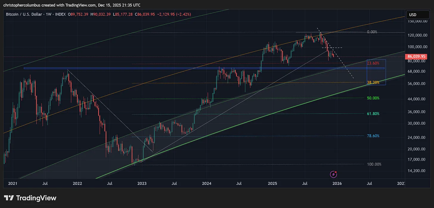
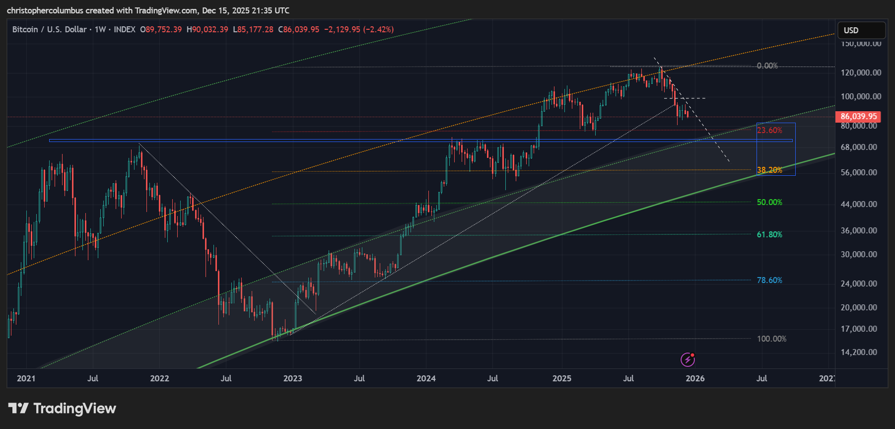
Shorter-Term Chart
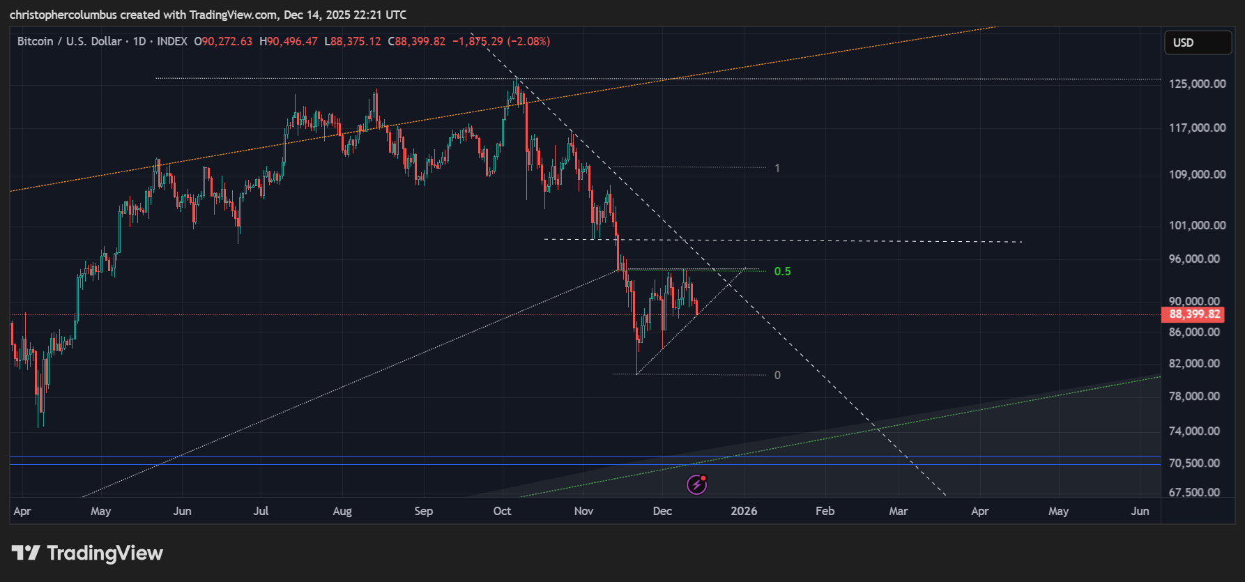
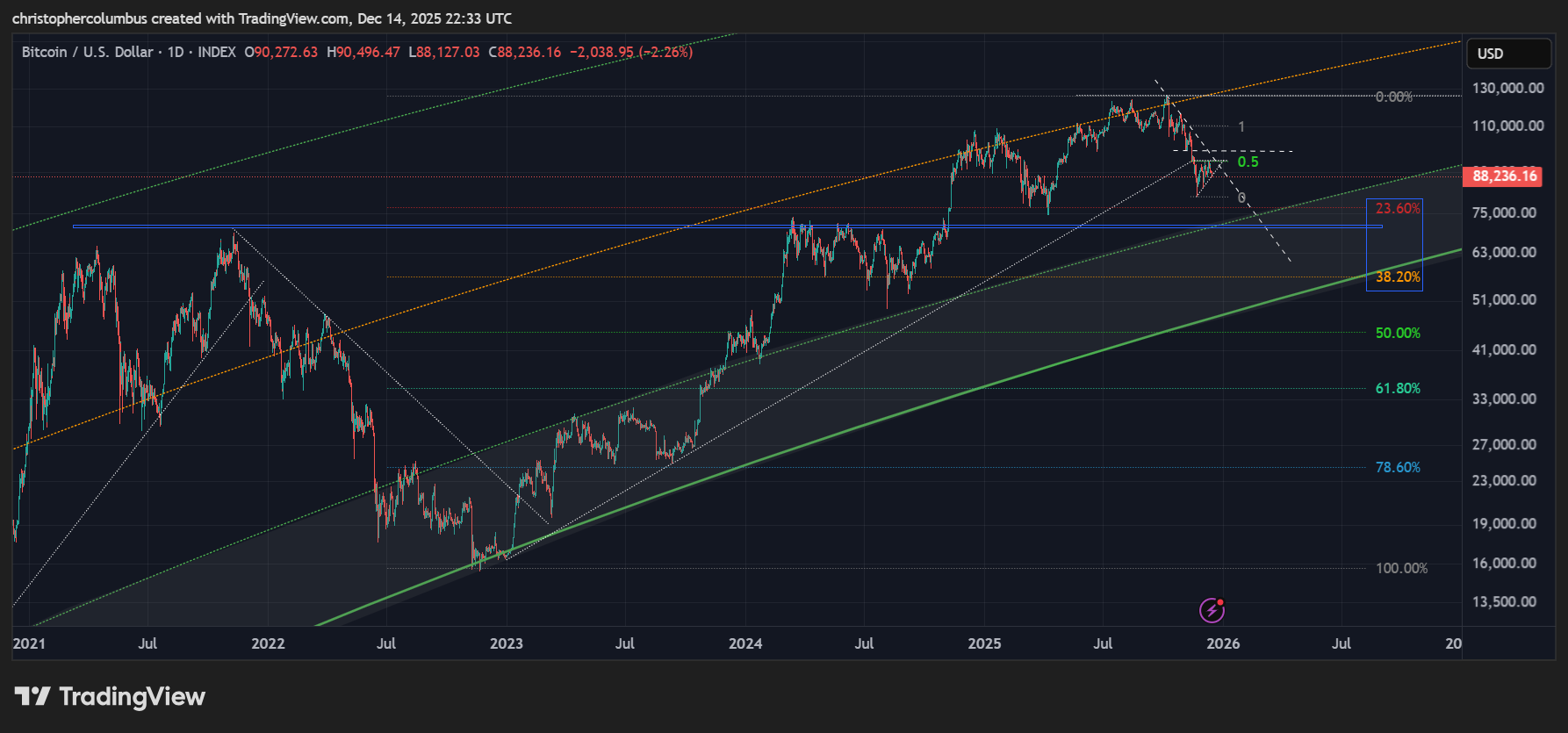
The lines of resistance [dashed bold] continue to dominate the chart. The horizontal resistance as drawn sits at the 100K mark, a significant psychological level for the market in my opinion once broken.
Some recent price action though is currently opposing this outlook in the formation of an ascending triangle in the more immediate term. A follow-through with a breakout to the fib extension target remains a possibility, but I think it more likely we see a further move to the downside. Here price is likely to meet macro support at around the 70K level as seen on the multi-year chart. In nominal terms, it seems a huge drop. In real logarithmic terms it would be around a 25% correction of the rise since 2023.
Longer-Term Chart
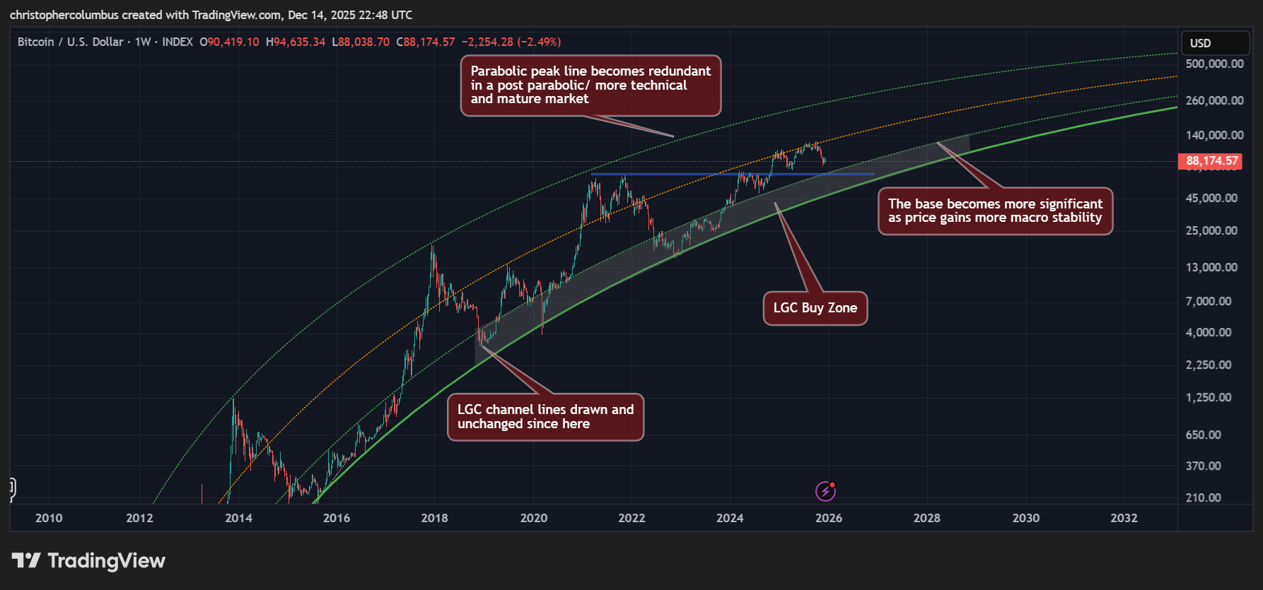
In a maturing market with reducing macro volatility, the upper line of the LGC channel looks now to have become redundant. There are both postive and a negative aspects to this. The negative being that the higher price does not come earlier [affecting mainly traders of the multi-year cycle]. The positive is that those prices would have only been temporary anyway [parabolic] leading to a huge correction on the down side. The positive here is that price is becoming less volatile and more sustainable while it moves toward price discovery/ full capitalization of an alternative currency [digital gold]. Of course, we all want to see higher prices here and now, but the shift toward a more technical mature market will lead increasingly to the view of BTC as a store of liquid capital in more mainstream conservative quarters… even as it increases in price more sustainably within the basing band [LGC buy zone].
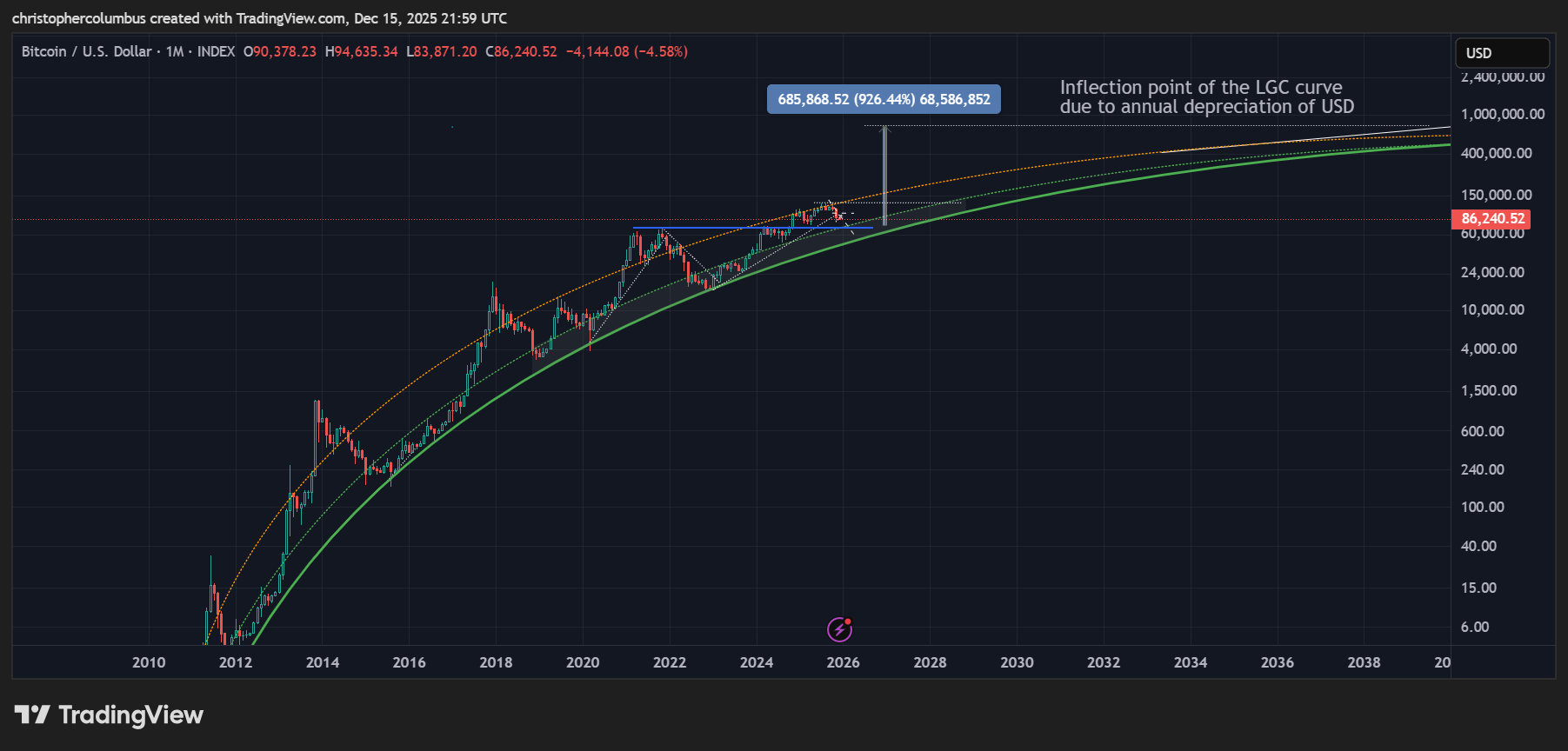
Zooming out to the model proper, one which represents the capitalization of Bitcoin the currency, we can see there is still a 10x return over the next decade on the table while it also remains a means to diversify/ hedge one’s liquidity [outside USD and gold]. The upper line of the channel is here removed to show the expectation of reduced volatility with price moving in a tighter band. Keep in mind also that the upper line was always converging/ plateauing to the lower line, in the longer-term, in the process of price discovery. Finally, back to the longer-term technicals over and above the LGC model and a ‘stress test’.
As mentioned earlier, the dominant technical factors on the chart are the lines of resistance [dashed bold] and the multi-year resistance come support [blue horizontal bar]. Given that this multi-year cycle has so far been a remarkably technical one with no over-heated parabolic moves, we can expect the price action to remain technical on the downside, i.e.; no post-parabolic crash. I’m still looking for support at 70K. The worst-case scenario/ stress test would be 57K, which would be a real correction of 38% [in log terms] of the multi-year move up with the LGC base [holding since 2018] providing solid support. Time-wise, we may be looking at half-way through next year before price bottoms along these lines.
Until next time,
Stay [relatively] safe out there,
Dave the Wave.