Rethinking the Theory of a 4 Year Cycle
Dear Readers,
Given we are currently closing in on the end of that BTC 4 year cycle that most have in mind, I think it timely to once again examine it. By looking at the strengths and weaknesses of the theory, we’re reminded that it is after all a theory and not a fixed idea or a dogma. As a theory, it’s always open to revision, or indeed invalidation. That it cannot be rigidly assumed.
First of, it is fair to say that the 4 year cycle is currently the dominant working theory. Even when it was being questioned last cycle, it played out… even if in an unorthodox manner [double top without the expected ‘blow-off’]. It is largely the established theory with a good record. But of course theories, even the best of them, are provisionally held and there to be broken or superseded.
The 4 Year Cycle
Four years back, I also revisited the theory in thinking the cycles might become increasingly irregular - the idea being that if the market is maturing, this would affect the grand cycles:
On the chart, the ‘cycle’ seems to be breaking up just as giant ice-sheets would in warmer waters. Nor should this surprise us in the face of a general principle, where a maturing market and increasing liquidity is understood to lead to reducing volatility - the single major volatile spike [and correction] may be broken up into a series of more minor volatile spikes [and corrections]. And so it is that the increased liquidity of a maturing [and very speculative] market suggests a re-visiting of what has to be the current ‘orthodoxy’ of cycles.
Of course, 4 year cycle theory was always based on the mechanics of halving, where the supply of BTC was seen as becoming increasingly scarce. In this article, I speculated that it would be scarcity per se as the main driver of price in a maturing market. This predicted a couple of of things:
1] A less volatile/ parabolic price action going forward
2] The eventual end of the 4 year cycle.
But Dave, the reader may be asking, what about halving, the mechanics of increasing scarcity, surely it’s the primary force behind the market. To which I’d reply, it may not be the particular mechanics of scarcity at all that is of significance to the market here, but scarcity per se. It is scarcity itself [just as gold is scarce] that will lead to the increasingly frequent episodes of speculation, and it is this speculation that wreaks havoc with the chart [or our neat ideas on how the chart should develop]. As speculative episodes become more frequent, so too might they become a little more restrained in their magnitude. In the aggregate, the volatility will reduce - what could be considered in this ‘cycle’ as increasing intra cyclical volatility, as relative to the previous cycle, may also be read as a breaking up of that grand cycle altogether.
So far, I think we can all agree that the first point above [reduced volatility] has played out. It remains to be seen whether the end of the 4 year cycle also plays out.
Where this previous article envisaged a series of smaller ‘speculative episodes’ either within or replacing the 4 year cycle, it has to be said that this cycle has been typified by a more stable price action in what is characterized as a more technical as opposed to a parabolic market.
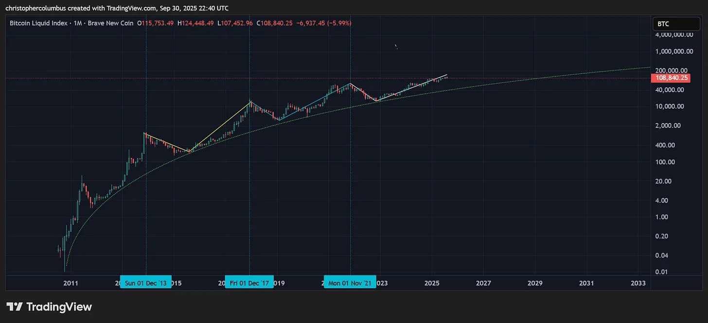
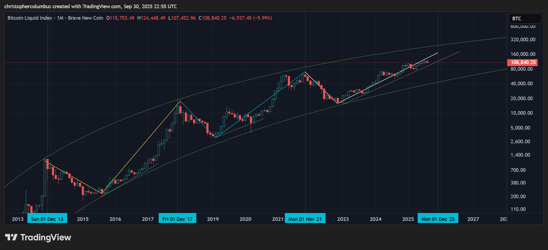
And so to the chart.
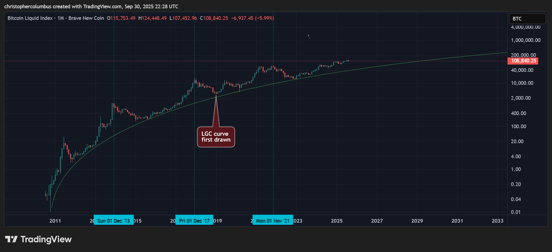
This first simplest chart shows long term price development as supported by the LGC curve [same curves since 2018]. Overlaid are the 4 year cycles, drawn from peak to peak for convenience. Beside the 4 year time-frame, the most consistent feature is the subsequent one year consolidations.
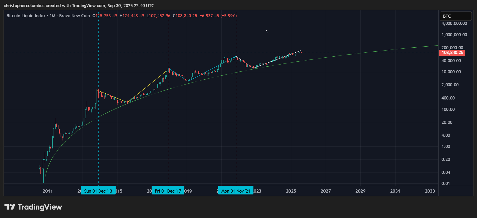
In the above chart, where there is really only two previous four year cycles to speak of, we can see reducing volatility of the price with each subsequent cycle.
The first cycle [yellow] has price well below the line and tracing a a simple parabolic move. The second cycle [blue] has a more irregular pattern - a mini-parabola and a double top - where price deviates less from the line, and to both sides of the line. This third current cycle [white] has price in remarkable proximity to the line. This looks to me as denoting a qualitative difference in the price action… and as explicable in terms of a maturing less volatile market as predicted well beforehand.
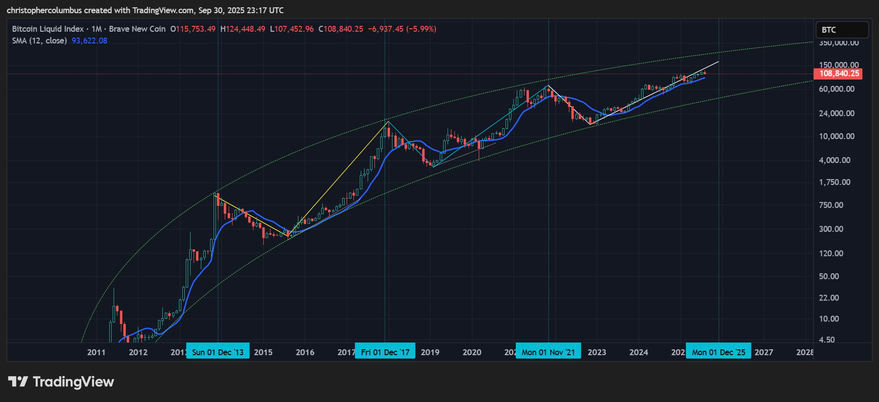
Another way of seeing this reduced volatility is by mapping the 1 year moving average onto the chart. That price is below the mean of price perhaps explains the negative sentiment in a market at the moment, which is one used to, or expecting, parabolic moves. And yet, as the 1 year MA shows, price has technical support.
If price is now more technical as opposed to parabolic, what would this mean for the supposed 4 year cycle?
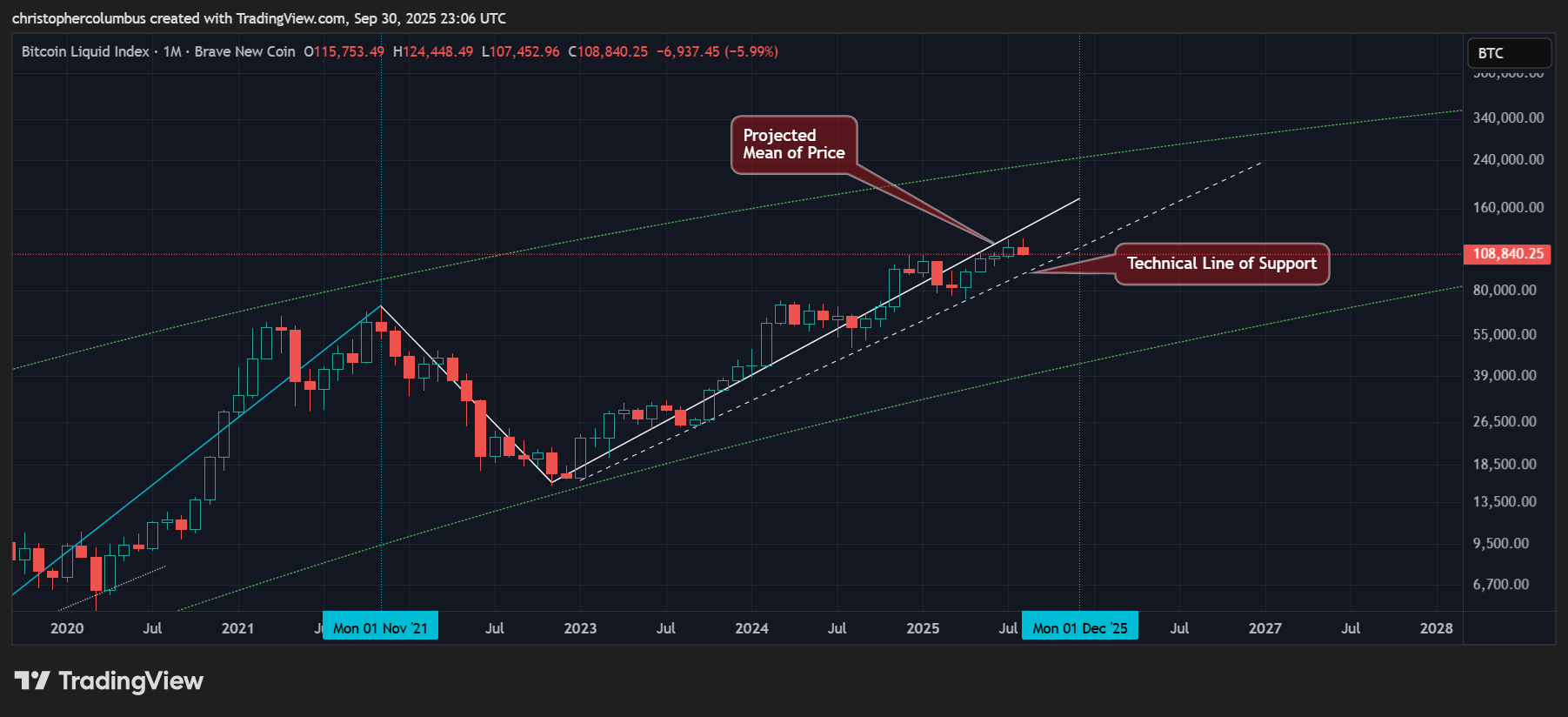
Must a Current Technical Market Conform to a 4 Year Cycle?
The most striking feature on this chart is the lack of parabolic price action and the more technical price action of this current cycle. A long-term diagonal support [lower line] runs from the low for multiple years while being tested at regular intervals.
If large one year corrections are the result of previous parabolas, then it makes less sense to expect such a drastic correction after multiple years of technical not parabolic price action. What the chart is showing is increasing price stability, which is something to be expected in an increasingly mature more liquid market.
Yes, the LGC channel is still predictive of consolidation of price but of something less steep and dramatic… given the more prosaic and technical nature of the previous rise.
Zooming In
If we were to approach this market in purely technical terms, ignoring for a moment the 4 year time line, then there is two outcomes more probable than a fourth quarter culmination of a 4 year cycle - that price continues to roll over here and through technical support or continues to find technical support into next year. Considering this, the technical nature of the market, it would almost be superstitious to insist on the 4 year cycle endpoint. Of course, it may happen, but the technical nature of this market should rule out that it must happen.
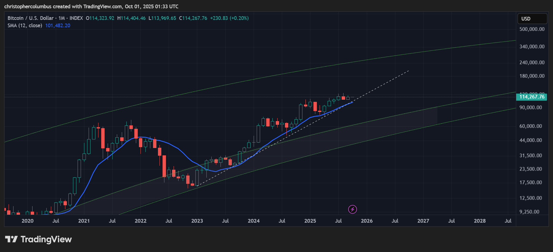
Taking the 4 year cycle out of the picture for the moment, technical support is clearly on the multi-year trendline and the 1 year moving average [not to mention price relatively low in the LGC channel]. Interestingly, the two happen to be aligned at the moment. Once/ if these were broken to the downside, some alarm that the multi-year bull run was expiring would be warranted [as per 'a DEFCON System' here].
On the face of it, based on the technicals, despite the sentiment, it is business as usual for a bullish outlook on price. There is nothing here to suggest that price is over-extended. It is only with a 4 year cycle getting long in the tooth [and the lack of a parabola] that people see an imminent correction coming. And though this is no doubt a consideration, given past history, it should not be over-weighted in my opinion given the reasons as outlined above.
Weekly MACD and Reducing Volatility
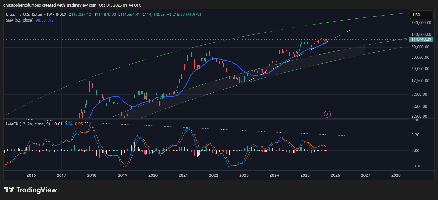
Lastly, the weekly MACD tells a story of reducing volatility even as price makes new highs. The MACD shows a pattern of resetting to the zero-line [and the 1 year moving average] to move up again. Though each move has been weaker off the zero-line, the MACD is still technically in bull territory [above the zero-line]. Until the trendline and moving average were broken, it seems to me to be reasonable to expect yet another fourth move up over this fourth quarter… and possibly into the new year if price action remains purely technical. As they say, bull markets climb a wall of worry.
Until next time,
Stay [relatively] safe out there,
Dave the Wave.