
The Correction
Dear Readers,

As long time subscribers among you are no doubt aware, I’ve always termed the state of the current BTC market as a macro correction in contrast to a bear market. This is because I’ve always preferred to take the longer-term view of Bitcoin’s price development, seeing a secular bull market punctuated by those severe and prolonged corrections, of which we are currently in the midst of one. And yet perhaps we are also coming to the end of one. Accordingly, it’s the aim of this article to illustrate that though BTC price is not rebounding to new local highs off the base [keeping sentiment negative], that base itself is getting rather extended, or long in the tooth, with the current range having held for quite some time. This itself is suggestive [never determinative] of a bottom forming from which new price is likely to recover in keeping with the parameters of the long-term trend. I’ll look at various metrics such as I invariably use from time to time in my posting on Crypto twitter - simple passage of time, the Gaussian Channel, and the MACD.
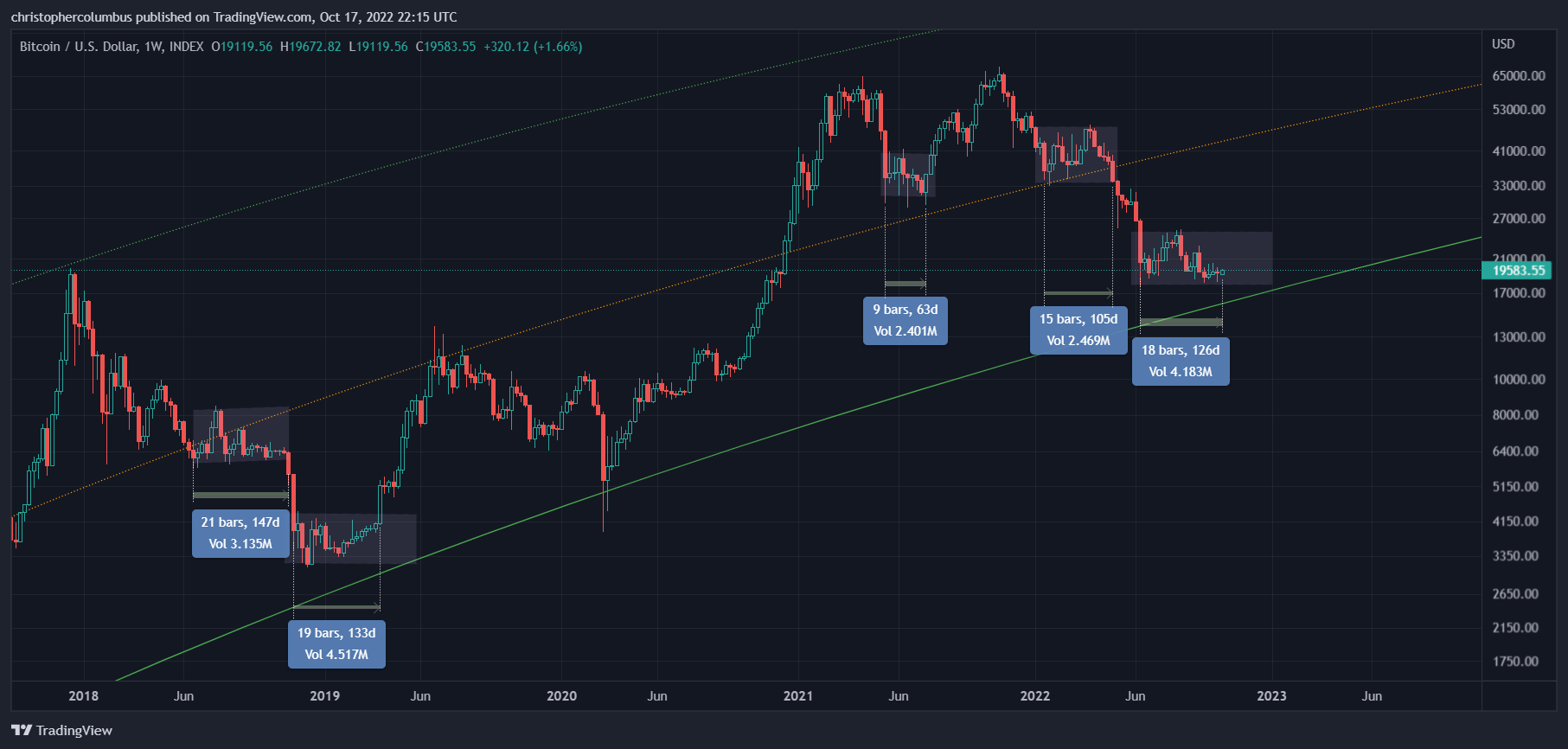
1] Passage of Time
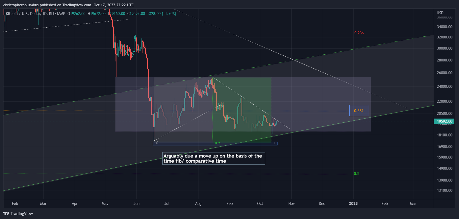
As seen in the following weekly chart, the current price range of 18 weeks is getting lengthy. It is longer than the previous ranges of 9 and 15 weeks. It is comparable now with the even earlier marked ranges of 21 and 19 weeks. If price moves up in the current range [arguably due on the second chart], then those earlier ranges will also be eclipsed. And the longer price holds up, the better chance a bottom is put in.
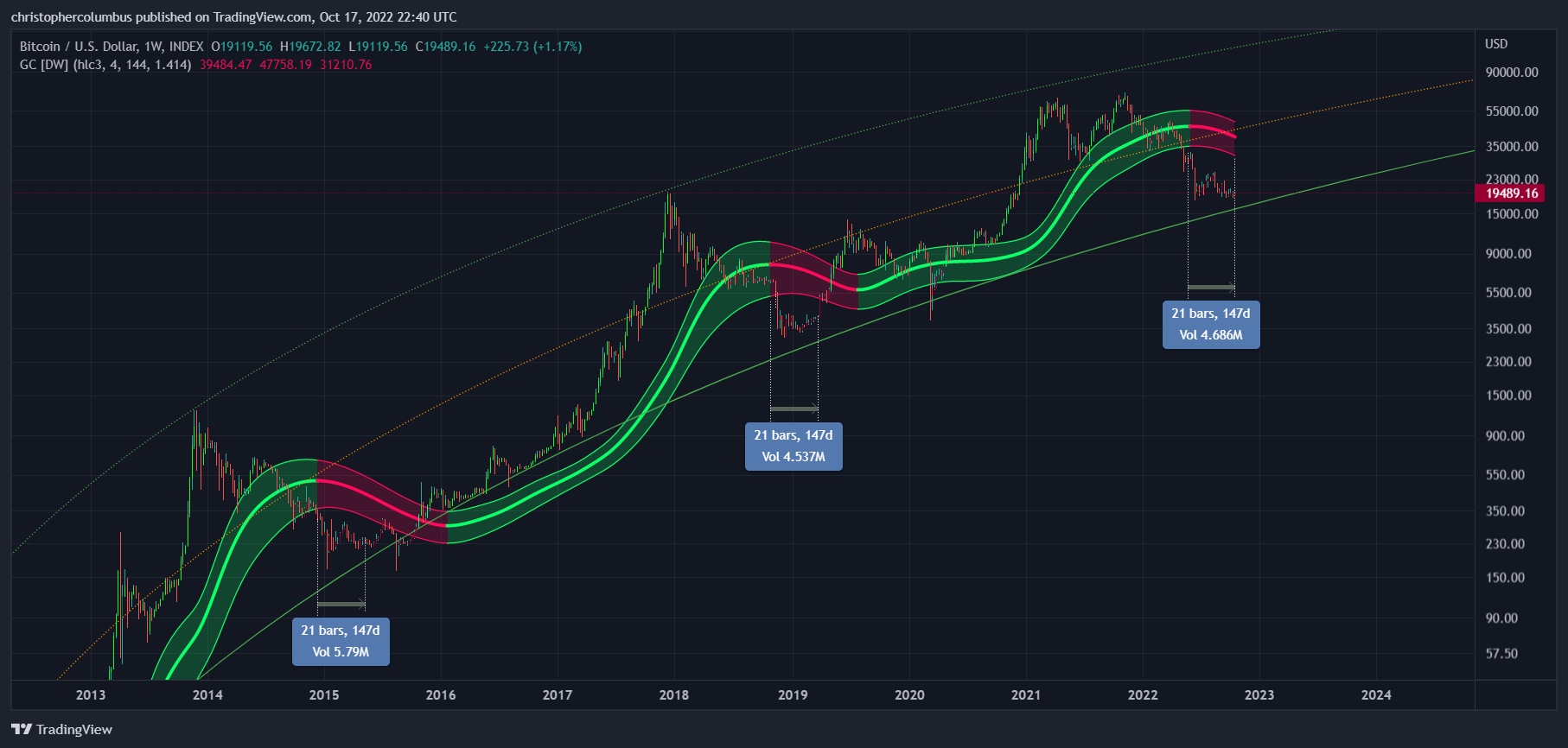
2] The Gaussian Channel
Another metric to consider - that will serve to counter-balance if not completely conquer the negative sentiment [as it should be, given the uncertainty principle] - is the Gaussian channel, a long-term momentum indicator. The first thing to notice is the manner of its ‘business as usual’ channel. It’s slow, it’s lagging, it takes the long road, and like an Ent [Lord of the Rings reference], the time-frame it deals with is on quite a different scale to the one shorter-term traders are used to by focusing on daily price action. This is the beauty of TA, it corrects our absorption in the volatility of the day to give us a more panoramic view. Though generally known as a lagging indicator, a reading of the dynamic and extrapolation of the trend also allows for a leading indicator - it well forecasted a good probability of a serious correction at the top [the near year-old tweet below]. Once again those with a geometric, logarithmic and visual imagination can take a technical reading of the likelihood of a bottom forming here - once again, an extrapolation of the current trend. Of course, those looking for [the illusion of] unhedged certainty will be disappointed with such an approach.

dave the wave🌊🐫 @davthewave
The parallel, if we're to look for one, is 2014 not 2013.

4:05 PM ∙ Nov 30, 202180Likes3Retweets
As for the 21 week time comparisons on the weekly Gaussian above, a couple of points. First, the better comparison is the more recent one given the principle of a maturing [more liquid] market. Secondly, even admitting the comparison of the earlier one, a move up is due with that range also kept.
Also of interest is the monthly Gaussian, and given the principle of the longer term the TA, the more reliable, then even of more significance.
To which I’d reply that the crucial factor here is time. If time were to be placed on a spectrum, with the shortest of periods at one end and the longest of periods at the other, randomness and possibility would belong to the shortest periods, while pattern and probability would belong to the longest periods. There would be varying degrees of probability/ randomness depending on what point of the spectrum you were dealing with - at the one end, minutes would be near completely random, at the other end, years would have a much higher degree of probability. Just as with any science, where momentary observations only start to make sense when accumulated into a mass over a longer period of time, so too with TA. It applies most effectively to longer time frames, where lines might be drawn, and trends discerned.
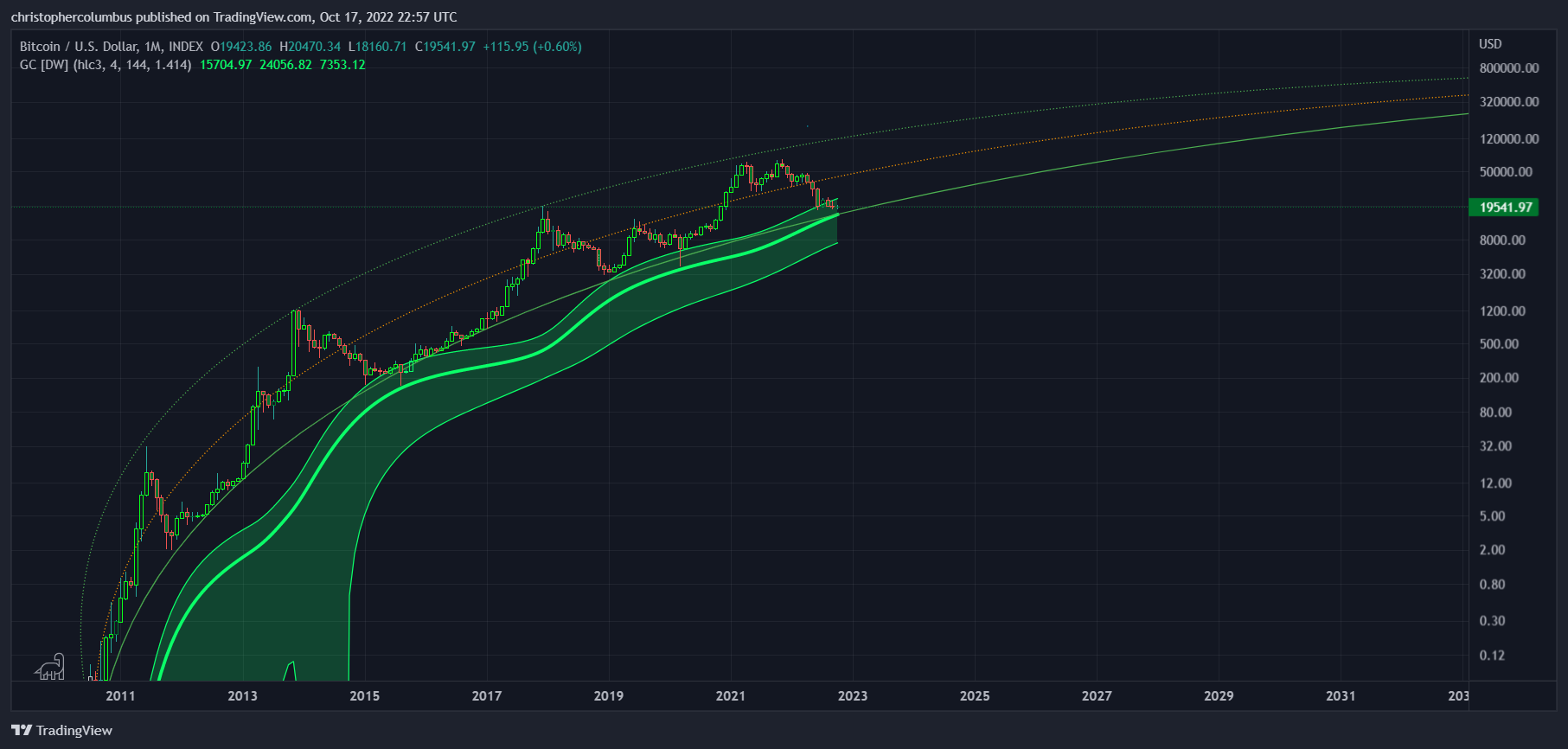
As can be seen in the above chart, where the Gaussian is now on the monthly, it’s usefulness as an extreme lagging indicator is evident - it illustrates that price eventually comes back to it subsequent to each ‘speculative episode’, parabolic rise, or ‘cycle’. It also nicely corresponds to the LGC, where the Gaussian also suggests the development toward price stability/ discovery along a trend of diminished returns [ROI dependent on where the investor buys]. Hence the need for discriminate buying, the use of TA.
3] The MACD
And to finish with my go-to indicator, the MACD. Once again, I’ll keep with the longest term time-frame of the monthly chart, which has to be the most reliable.
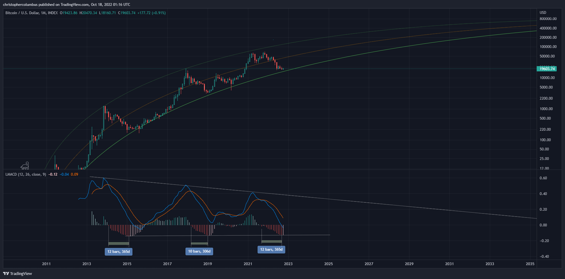
Of note in the MACD is the number of expanding histograms that reflect weakening momentum. The current number is more than the previous correction, and the same as the correction previous to that, i.e.; the current correction, by previous standards, is getting lengthy. Note also the possibility of seeing the first strengthening histogram. Though we are well into the month, this as of yet needs to confirmed at the close of the month. Previously, recovery and new all-time-highs followed on from the first strengthened histogram - once flipped, it has gone from strength to strength and then into the green. Notice also that the length of the particular histograms themselves match up [by the lower line]. This signals the peak loss of momentum imo… to be followed by strengthening momentum. All of which concurs with the base area of the LGC [Logarithmic Growth Curve].
Conclusion
After all of this, the reader may be thinking I have a bias. And they’d be half right. But where ‘bias’ has that negative connotation, I prefer to use the word hypothesis [see last article here], which has a much more positive and rational meaning affixed to it. A hypothesis allows for both subjectivity and uncertainty, whilst also allowing that one’s speculations [about market speculation] are rational insofar as they are to be rigidly tested by experience; that is, by the unfolding of price action over time. In this sense, my approach is fully empirical and scientific, fully provisional and hedged, which has to be a million miles removed from the kind of bias that has people swinging wildly one way and then the other. Bias seems to me but really just a reflection of sentiment, and need I say yet again that hypothetical TA is the correction of that sentiment if not the complete negation of it.
Until next time,
Stay [relatively] safe out there,
Dave the Wave.